
IT Tips & Insights: Learn how to harness the power of Azure Workbooks with step-by-step instructions from a Softensity Software Engineer.
By Mario Leiton, Software Engineer
Ever wondered what you can use to get data from multiple Azure sources, into one place, and with different types of interactions? Azure Workbooks is the answer. Workbooks is part of the Azure Monitor services and it offers a solution to monitor and integrate different data sources across your Azure tenant, making an excellent unified experience for monitoring or reporting users.
Azure Workbooks also offers:
- At-scale views across multiple resources
- Visualization of related data in a single, interactive report
Data sources for workbooks can query data from multiple sources within Azure. Whoever creates the workbook can analyze what type of data they will get into workbooks. You can then transform the data and provide insights for the rest of the users. This also provides the capability of looking into the availability, performance, usage, and overall health of the components and services sharing their logs through the different data sources connected to the workbook.
Connecting multiple sources into workbooks is just the first part of this journey. The real deal comes when you combine the data from the multiple sources within a single report, as this allows for the creation of composite resource views or join views, enabling richer data and insights that would not be possible with other out-of-the-box monitoring tools.
Workbooks are currently compatible with the following types of data sources:
- Logs
- Metrics
- Azure Resource Graph
- Alerts (Preview)
- Workload Health
- Azure Resource Health
- Azure Data Explorer
Visualizations are another feature of workbooks that provide a rich set of capabilities to show up your data. These are the current forms of data we can work on with Workbooks:
- Text
- Charts
- Grids
- Tiles
- Trees
- Graphs
- Composite bar
- Honeycomb
- Map
An example of visualizations:
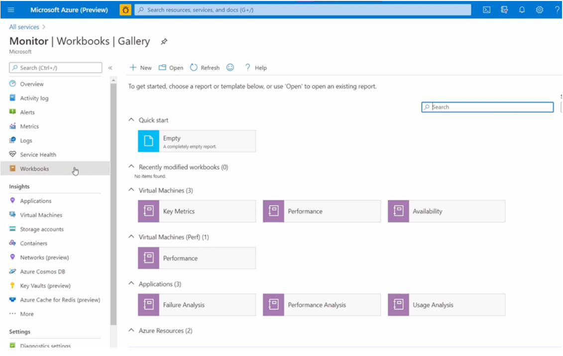
Here is how you can access Azure Workbooks:
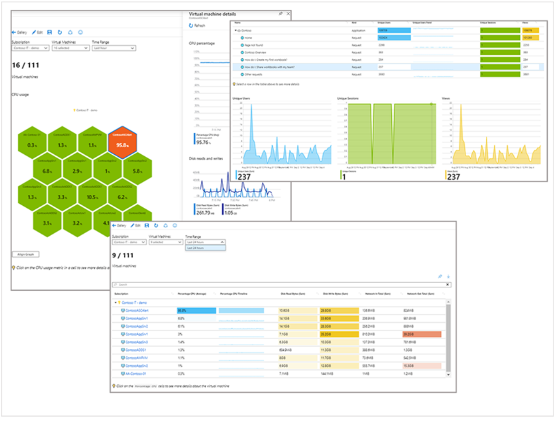
Next, we’ll see what a workbook looks like, and what we can do with it. In the next image, we can see a workbook for virtual machine performance:
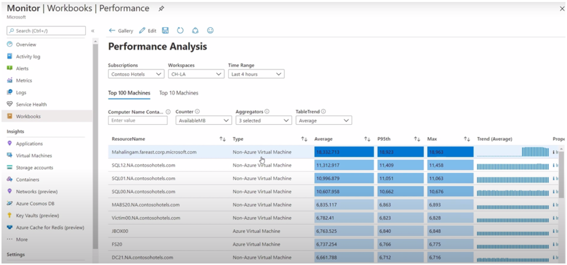
Here you can see we are showing common performance metrics such as CPU, memory, and its usage across several VMs from multiple Azure Subscriptions for a bigger picture at scale type of view. This includes tables with trending charts for easy sorting.
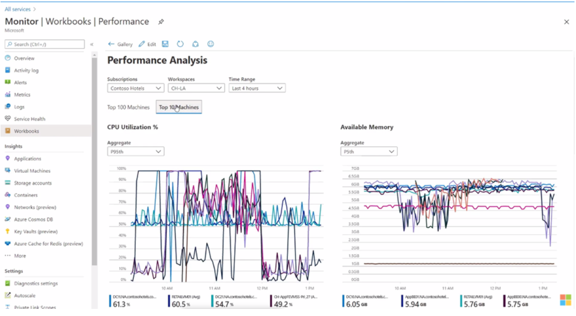
Now, if we change the tab to show the top 10 machines, there are line charts for easy visual comparison:
Let’s move beyond the Performance Template to take a look at a Failure Analysis workbook.
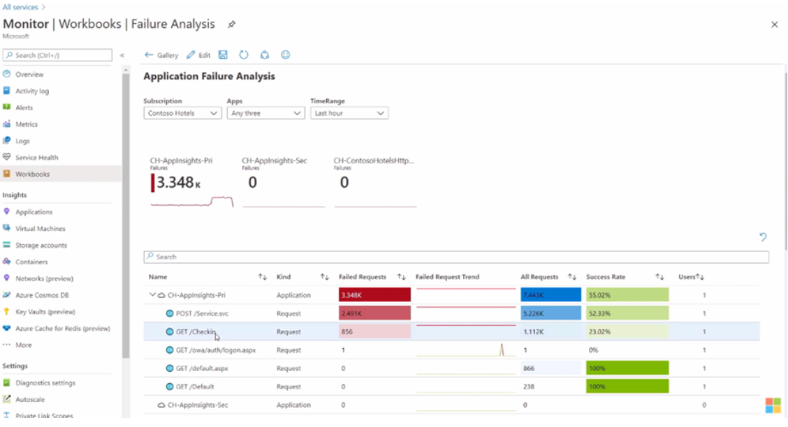
In this view, you can see the application requests, failures, success rates, and the number of affected users for up to three different application resources at the same time.
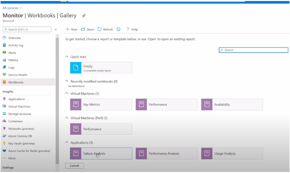
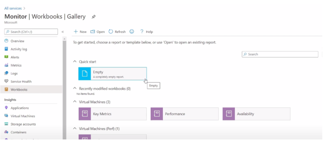
Now, let’s see how to work with a workbook from scratch. You can select ‘Empty’ workflow from the Workbooks Gallery:
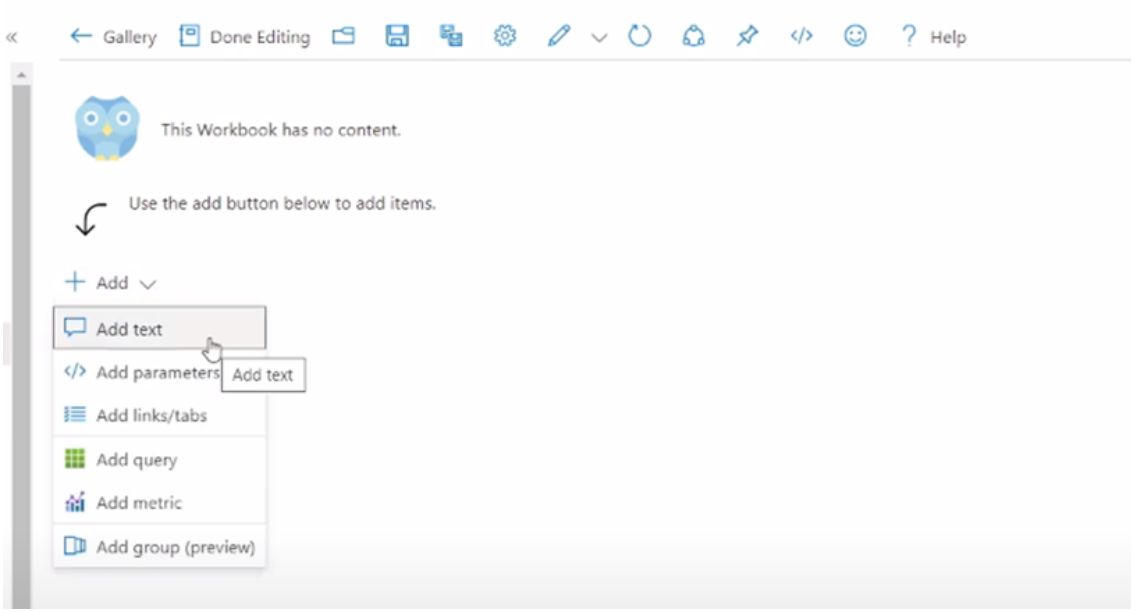
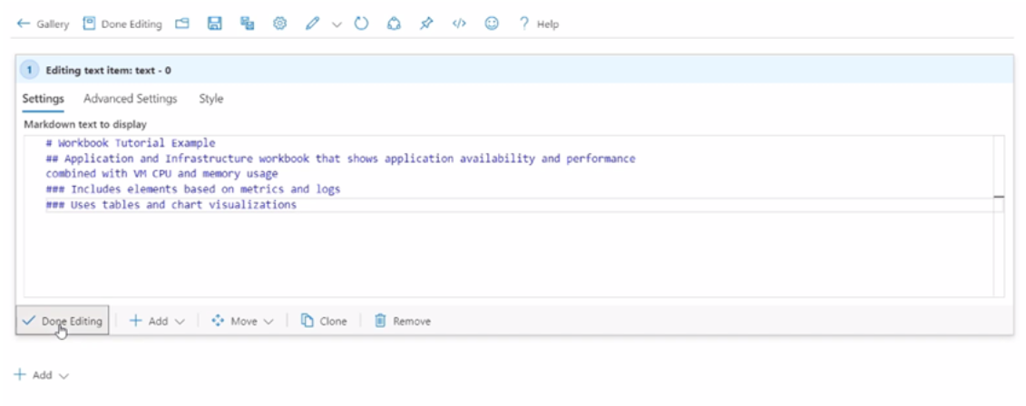
We can start by adding some text that describes what the workbook does.
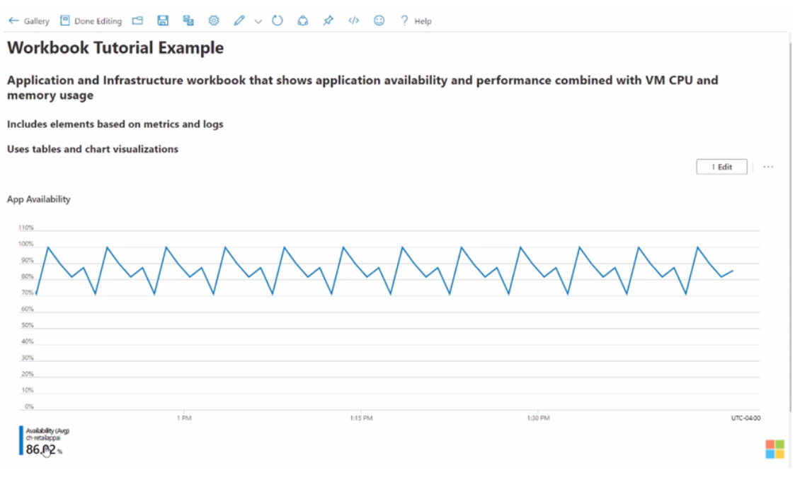
In this example, we will build a workbook that shows the availability and performance at the application layer and then compares those metrics on the infrastructure from the VM on which the application is running.
Next, we will add a line chart showing the application availability, using metrics.
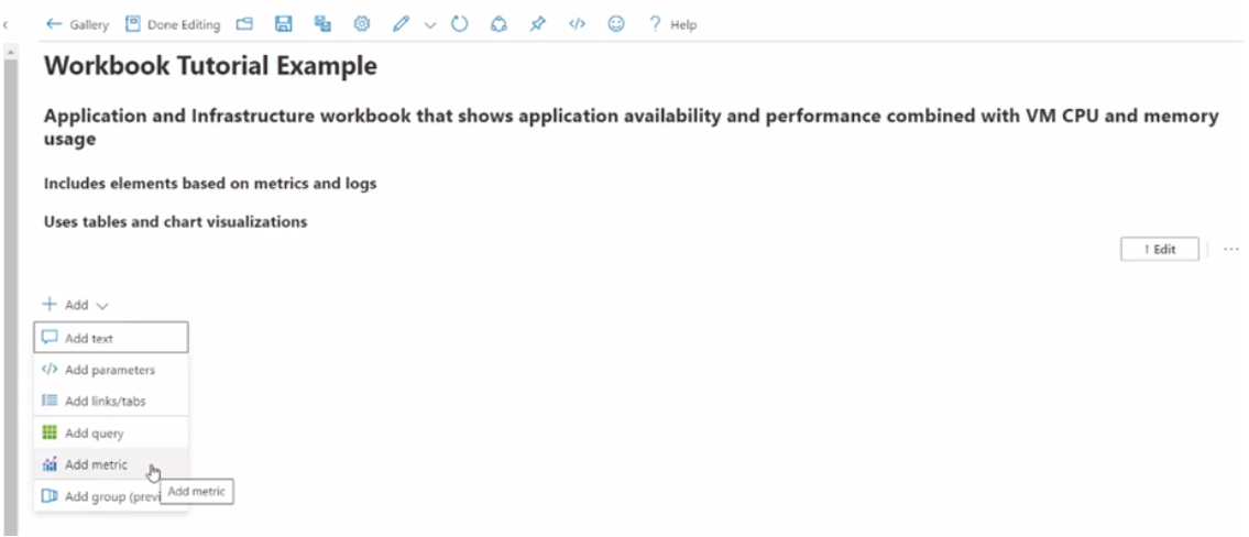
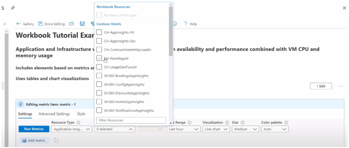
First, we can select the resource type:
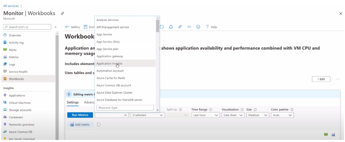
Then my application insights resource:
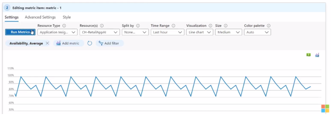
In this case, we have the default simple line chart visualization. Once that has been made, we can move on to selecting the metric and aggregation type.
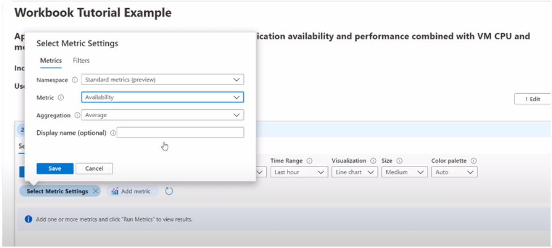
Remember to click on Run Metrics to create the chart and preview the results.
It is also a good practice to add a title to each of your charts, tables, and graphs, so you remember what type of visualization you are looking for. Add the title like the following screenshot:
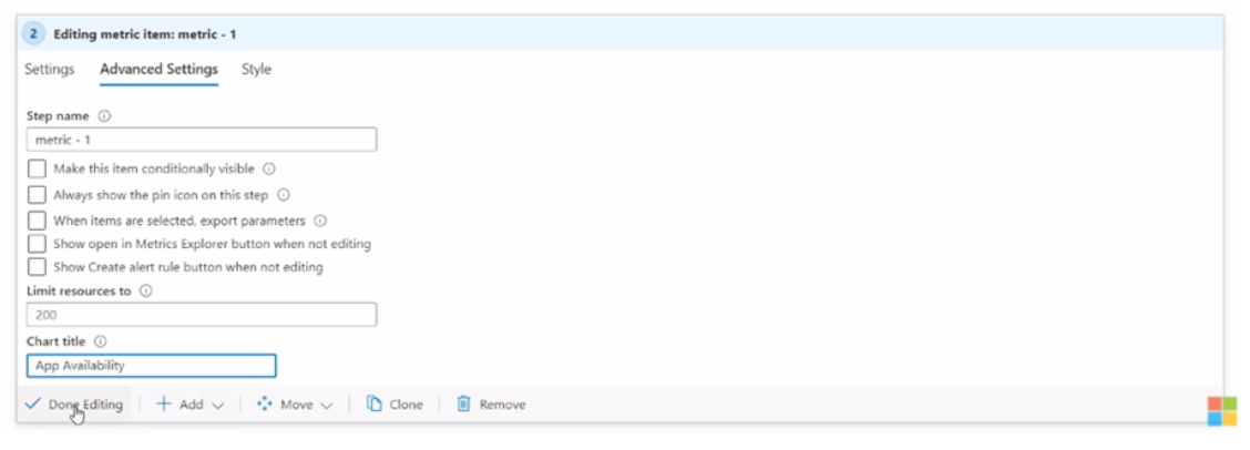
Click on ‘Done Editing’ and there you have it, your first visualization on Azure Workbooks.
Now, remember that the real power of Azure Workbooks comes when we combine multiple sources into one visualization. So, let’s create a second one.
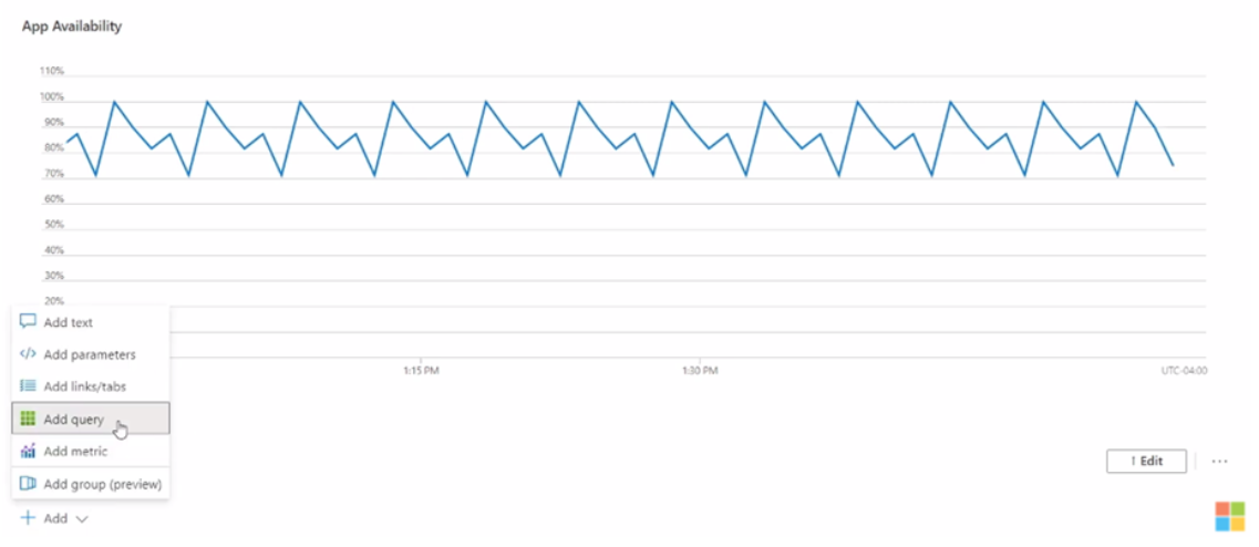
Let’s say we also want to display the response time of each application request by its name. That is the duration of each request by operation name. Let’s do this by using Azure Monitor logs as its data source. Let’s click on Add and add a query to get started:
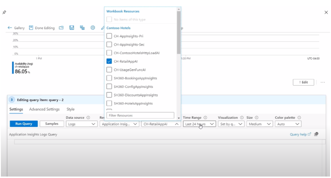
Now here you can see that you can add multiple criteria for your query, and then add the query itself for the results you want to see. This will use Kusto Query Language or KQL. If you are familiar with KQL, you can start adding a query on the query editor:
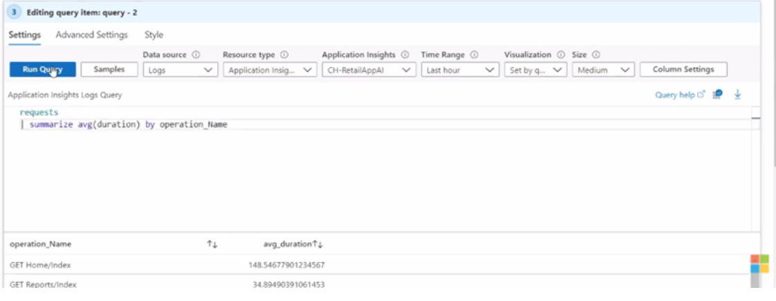
We will start with a very simple query to pull back the request table. We will then summarize these requests by average duration and then sort them in descending order in the table.
Following the same good practice of naming convention for your visualizations, go to the Advanced Settings tab and add a title to it:
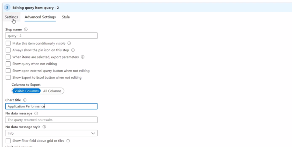
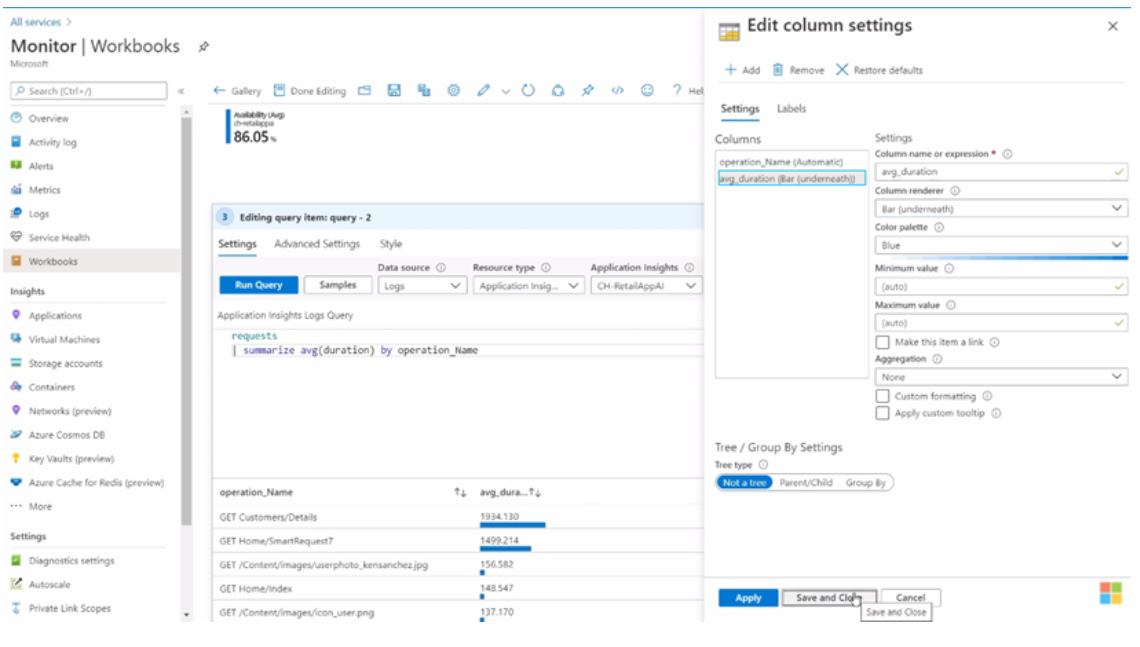
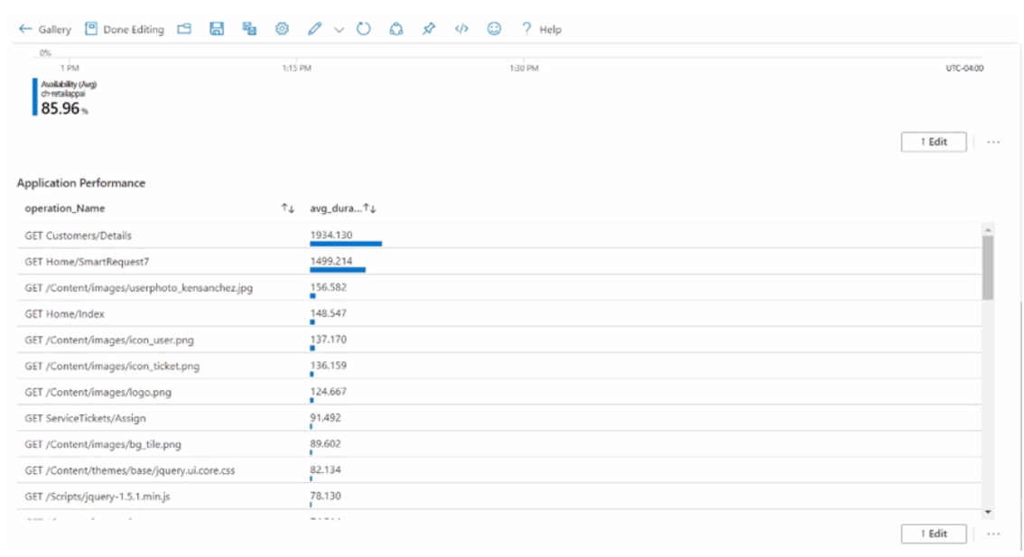
So, here is a final table showing application response times with another interesting visualization technique that highlights the differences in duration:
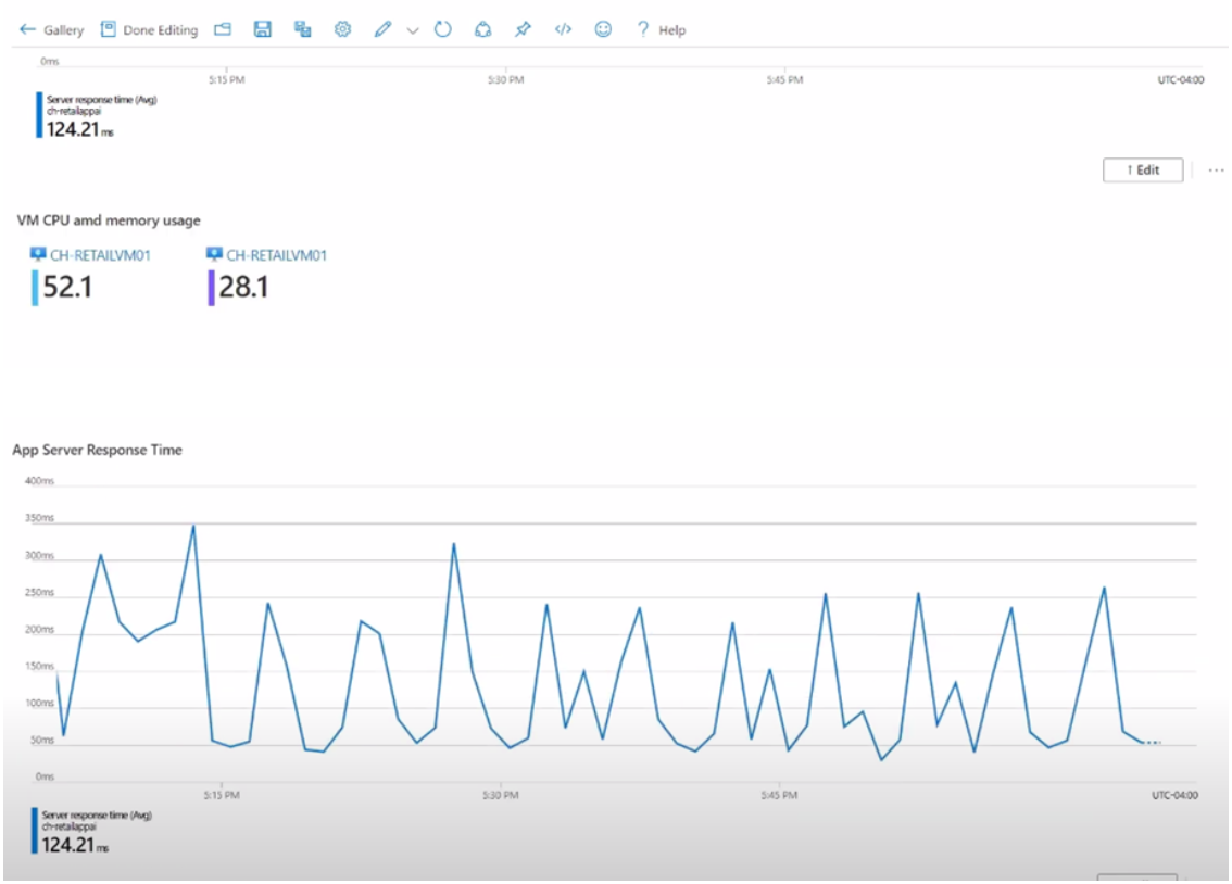
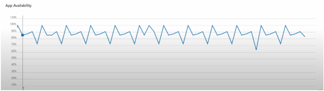
Like what we have done previously, we can add metrics that show CPU and memory, server response time, availability, and performance, all of this in a single space called Workbook:
Of course, this article just scratched the surface of what can be done with workbooks. You can, of course, add more parameters to show up on your charts, combine them together, and write more complicated queries, or you can use more sophisticated visualizations. Remember to save the workbook so you can have it available later.
Azure Workbooks is a solution that can combine multiple forms and methods to transform and display data and put those results into one place for better readability and improved productivity, rather than having to look for monitoring logs in different places.
About

Hi, my name is Mario and I’m a software engineer that works with Microsoft Azure. I also have experience with AWS and GCP. C# and .NET are where I develop my skills, along with DevOps technologies. I have also worked as a Web Developer with NodeJs and I want to further sharpen my Cloud skills and master new technologies, pointing to productivity for developers and end-users.